Hidden line removal progress
 1-13  14-33  34-53  54-73  74-93  …  294-296

Previous
Next
 From:  Michael Gibson
6201.34 In reply to 6201.27 
Hi eric,

> Just using the viewport display as an example ... I would like to be able to export to .pdf with this look.

Yeah I think that will be possible. Probably by default the hidden lines on PDF export will not be displayed but I'll put in an option for having them and when they are enabled it would make sense to give them a faint dashed line style in the PDF file as well I think.


> Now when I export to pdf the hidden lines are solid and as strong as the outer edges.

Yeah in the current version it's just a total wireframe export with no hidden line determination happening at all, this new stuff I'm working on is a major change in this area.


> However, the hidden lines only show as dashed when I zoom in as far as my display allows
> but when I save the normal sized screen display to the clip board and then import it in PhotoShop
> the hidden lines are simply faint light lines ... so if I had a choice I would like the hidden lines to
> display as somewhat thicker than they are now and a little more broken.

Are you using a keyboard shortcut script to do the transfer to photoshop currently? Can you please post the script that you're using? It's probably possible to adjust the script to increase the line width and that ought to make the dash pattern scale up as well so the spaces between dashes won't be so tiny. Right now the dashes are probably so tiny in comparison to the rest of the image that they blur all together.

- Michael
  Reply Reply More Options
Post Options
Reply as PM Reply as PM
Print Print
Mark as unread Mark as unread
Relationship Relationship
IP Logged

Previous
Next
 From:  Michael Gibson
6201.35 In reply to 6201.28 
Hi Matt, so in this last one that you've posted, this one here (from isodraw):


That's slightly different than what you posted before or what was in Martin's example, because both of those edges are thick in this one, meaning both the red and the blue one I've indicted here:


In your other case you had only one of those edges thickened... With only one thickened the question becomes "which one should it be"... and if it's just an artist's judgement call that's not easy to replicate in computer code.

So I'd probably be shooting for doing the same as Isodraw here and having all silhouette edges get thickened...

Does that make sense? Or is there some specific rule for targeting just one of these 2 possible hole silhouette edges?

- Michael
Attachments:

  Reply Reply More Options
Post Options
Reply as PM Reply as PM
Print Print
Mark as unread Mark as unread
Relationship Relationship
IP Logged

Previous
Next
 From:  Michael Gibson
6201.36 In reply to 6201.29 
Hi Brian,

> I am a non-expert, but did a google search for lineweight sketching, and
> line weight hierarchy. Found 3 rules here:

Yeah I guess that a "sketch" has its own kind of structure that's somewhat separate from "technical illustration".

In the future I would really like to have more options for sketch like output as well but first I think the focus will be more on the illustration and "shop drawing" type stuff instead.

- Michael
  Reply Reply More Options
Post Options
Reply as PM Reply as PM
Print Print
Mark as unread Mark as unread
Relationship Relationship
IP Logged

Previous
Next
 From:  Michael Gibson
6201.37 In reply to 6201.33 
Hi Martin,

> Actually the way I would do it and also the way that seems to be most logical is the
> attached result by Cinema4Ds Sketch & Toon renderer. This is also similar to mattj example
> from post 6201.28 but without the "overshoot" which again is a personal style.

The style you're showing here is having an accent on the "border against background", having thickness just where the shape touches the background. That's what I'd like to enable by some kind of "outline" option for extracting out those curves.

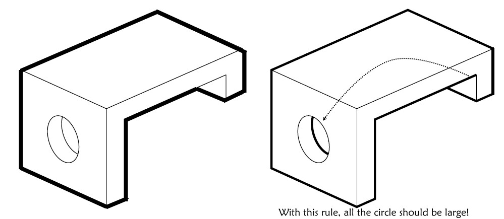
The other style is not just a difference with "overshoot", it's more about accenting all silhouettes of the object, not just the outermost one. A shape like this should show a bigger difference:


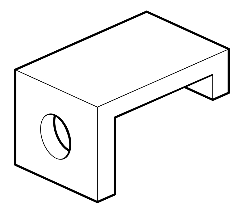
Just the "outline against background" would be like this:


But all silhouettes would be like this:


So I think I want to be able to do both of these kinds of things, like one option to get silhouettes into their own kind of group and another option that will extract out the outer outline only.

Maybe when enabled the outer outline curves would be a duplicated set of curves going over top of the other kinds though.... Not quite sure about that part.

- Michael

  Reply Reply More Options
Post Options
Reply as PM Reply as PM
Print Print
Mark as unread Mark as unread
Relationship Relationship
IP Logged

Previous
Next
 From:  Michael Gibson
6201.38 In reply to 6201.28 
Hi Matt, also I see now that one thing I got confused about comparing your "insect walking" picture against the one Martin posted, was that your one was only a depression and not a full hole all the way through, is that right?

That's why you only had one accented line there, because there was a floor in yours.


Martin, the one that you posted from http://purdy.gatech.edu/wp-content/uploads/2012/07/2_line_wt.pdf - I don't see how I'm going to be able to get that same result with only one of the silhouettes of that through-hole being accented, it's not clear to me which one it would supposed to be so instead I'll probably do both of them.

- Michael
  Reply Reply More Options
Post Options
Reply as PM Reply as PM
Print Print
Mark as unread Mark as unread
Relationship Relationship
IP Logged

Previous
Next
 From:  Marc (TELLIER)
6201.39 In reply to 6201.22 
"""""""""""""I'm not sure about doing a preview, it would be nice to have but I've got to balance that against how much time it would take to implement it"""""""""""""""

I understand, it might be overkill for this feature.

An options button might be interesting instead of adding another dialog.
It would make it a simpler and less intrusive, you change it only if you have to.
Saves could 'stick' between sessions.


Marc
Attachments:

  Reply Reply More Options
Post Options
Reply as PM Reply as PM
Print Print
Mark as unread Mark as unread
Relationship Relationship
IP Logged

Previous
Next
 From:  Martin (MARTIN3D)
6201.40 In reply to 6201.38 
>Martin, the one that you posted from http://purdy.gatech.edu/wp-content/uploads/2012/07/2_line_wt.pdf -
>I don't see how I'm going to be able to get that same result with only one of the silhouettes of that through-hole being accented,
>it's not clear to me which one it would supposed to be so instead I'll probably do both of them.

I regret posting this as it just added confusion. I didn't look carefully. The example shows a subjective way thats difficult or impossible to put into some sort of rule.
I'm fine with your "border against background" method that gives me a rendering like this:


  Reply Reply More Options
Post Options
Reply as PM Reply as PM
Print Print
Mark as unread Mark as unread
Relationship Relationship
IP Logged

Previous
Next
 From:  Frenchy Pilou (PILOU)
6201.41 In reply to 6201.40 
What will the rule of the internal up arc-circles if this block was on a red table ?
Same rule than an empty backgorund ?
B is satisfying ?


An not only the 2 little arc circles ! As soon as a line has a free touch background all the line must be large!
So a very complex rule!

EDITED: 30 Sep 2013 by PILOU

  Reply Reply More Options
Post Options
Reply as PM Reply as PM
Print Print
Mark as unread Mark as unread
Relationship Relationship
IP Logged

Previous
Next
 From:  Martin (MARTIN3D)
6201.42 In reply to 6201.41 
It's not complicated: Every edge that "touches" the background must become thick.
It's a way to better visualize the object.
The same way Photoshop would apply an Outer Glow Layer Style to a transparent pixel image.


  Reply Reply More Options
Post Options
Reply as PM Reply as PM
Print Print
Mark as unread Mark as unread
Relationship Relationship
IP Logged

Previous
Next
 From:  Martin (MARTIN3D)
6201.43 In reply to 6201.42 
So your example must look like this
Image Attachments:
Size: 62.6 KB, Downloaded: 24 times, Dimensions: 669x546px
  Reply Reply More Options
Post Options
Reply as PM Reply as PM
Print Print
Mark as unread Mark as unread
Relationship Relationship
IP Logged

Previous
Next
 From:  Frenchy Pilou (PILOU)
6201.44 In reply to 6201.43 
Yes simple for your example and rule but i have spoken of this one (and it's mixed rule under lined)
http://purdy.gatech.edu/wp-content/uploads/2012/07/2_line_wt.pdf
who seems it-self not well applyed on its example! :)

So be simple is the more easy way! :)
  Reply Reply More Options
Post Options
Reply as PM Reply as PM
Print Print
Mark as unread Mark as unread
Relationship Relationship
IP Logged

Previous
Next
 From:  bemfarmer
6201.45 In reply to 6201.44 
Martin's rule looks very good, and simple, for having a "heavy" and a "light" line weight.

As in Conrad Taylor's pdf, adding an intermediate line weight, and/or continously tapered line weights,
and/or broken lines, and/or dotted or dashed lines could add additional rules for the computer programmer to figure out :-)

Background tone helps visualization also.

- Brian
  Reply Reply More Options
Post Options
Reply as PM Reply as PM
Print Print
Mark as unread Mark as unread
Relationship Relationship
IP Logged

Previous
Next
 From:  Mike K4ICY (MAJIKMIKE)
6201.46 
When I was an art director, this was how I taught my artists to weight their line-art drawings.


To emphasize depth. More interior detail would carry thinner associated line weights.

Impossible, I know. The little inside-only buildup doesn't sit well with me.

None the less, I'll be happy to see what comes of all this.
  Reply Reply More Options
Post Options
Reply as PM Reply as PM
Print Print
Mark as unread Mark as unread
Relationship Relationship
IP Logged

Previous
Next
 From:  Frenchy Pilou (PILOU)
6201.47 In reply to 6201.46 
On this object that seems yet easy
but for a complex one that surely be a nightmare for the coder! :)
Because there is no logic reason that the entiere side circle will be not entierely large, if the straight line "horizontal" is itself large!
They are "touching" both some empty "background"!
  Reply Reply More Options
Post Options
Reply as PM Reply as PM
Print Print
Mark as unread Mark as unread
Relationship Relationship
IP Logged

Previous
Next
 From:  Martin (MARTIN3D)
6201.48 In reply to 6201.47 
> When I was an art director, this was how I taught my artists to weight their line-art drawings.

This certainly looks very good but I have a hard time understanding the rule that requires to continue the thick horizontal line into the object. It's an aesthetical choice isn't it? It looks good and helps even more to understand the shape but it seems to be impossible to put into an algorithm.

Attachments:

  Reply Reply More Options
Post Options
Reply as PM Reply as PM
Print Print
Mark as unread Mark as unread
Relationship Relationship
IP Logged

Previous
Next
 From:  Mike K4ICY (MAJIKMIKE)
6201.49 In reply to 6201.48 
> seems to be impossible to put into an algorithm.

I do understand the conundrum. This is a tricky thing to negotiate with solid/flat objects. If I was drawing this with pen and paper where the line quality had a bit of natural "grunge" in it, the thick line may have tapered to match the thinner line, or the thinner vertical line would have shared the transition. This is easier to envision when drawing more organic character.

Not possible it seems to do with splines and outlines.
  Reply Reply More Options
Post Options
Reply as PM Reply as PM
Print Print
Mark as unread Mark as unread
Relationship Relationship
IP Logged

Previous
Next
 From:  eric (ERICCLOUGH)
6201.50 In reply to 6201.34 
Hi Michael ..

Yes I do use a script that you did some months ago. I changed the line width to 6 (from 4) and it does now show the hidden lines as small but distinct dashes. I may increase that number to 8.

thanks,
eric
  Reply Reply More Options
Post Options
Reply as PM Reply as PM
Print Print
Mark as unread Mark as unread
Relationship Relationship
IP Logged

Previous
Next
 From:  danperk (SBEECH)
6201.51 
Hi Michael,

Is it possible to isolate the red lines into a separate layer when exported?

Attachments:

  Reply Reply More Options
Post Options
Reply as PM Reply as PM
Print Print
Mark as unread Mark as unread
Relationship Relationship
IP Logged

Previous
Next
 From:  Michael Gibson
6201.52 In reply to 6201.39 
Hi Marc,

> An options button might be interesting instead of adding another dialog.
> It would make it a simpler and less intrusive, you change it only if you have to.
> Saves could 'stick' between sessions.

That's definitely less intrusive, but sometimes less intrusive also means the settings are just not found by many users...

I also sort of like to avoid messing around with the system standard dialogs very much. The regular Windows system dialog does not have a button like that. It's possible to customize the dialogs in different ways but it's not all that unusual for that to have maintenence problems down the road.

- Michael
  Reply Reply More Options
Post Options
Reply as PM Reply as PM
Print Print
Mark as unread Mark as unread
Relationship Relationship
IP Logged

Previous
Next
 From:  Michael Gibson
6201.53 In reply to 6201.40 
Hi Martin,

> I'm fine with your "border against background" method that gives me a rendering like this:

A couple of questions about the "border against background" option. I'm thinking of calling it something like "Generate outlines", and when enabled it would make an extra set of curves on separate kind of grouping (grouped either as an actual group or layer or separate color or lineweight or maybe any of these) that would be coincident with the regular edges. So that would mean that the outline curves would stack up on the "regular edges". The reason for this is that otherwise to not have separate stacked up curves would mean having the regular edges broken up into smaller pieces which seems kind of weird. Like on your example this area here:


And also another reason to make the outline a separate set of curves is that I think you'll want the outline to go underneath all the other regular edges and I guess underneath the shaded image as well so that when it's thickened it only adds thickness to only one side of the shape rather than having thickness on both sides. I don't believe that there is any way in PostScript to add thickness to just one side of a path rather than having the thickness be symmetrical around the path center line, I think it has to have some kind of masking for an effect like that.

Then the other thing is that if you have separate multiple objects, I would think that the outline would treat spots where it borders on either the background or the other object as an outline area, so for example with 3 objects like this (that don't touch each other, they just block one another in visibility):


Then I'd think that the outlines would go like this:


Does that seem right? The other possibility would be for outlines to only go against strictly the background and not other objects at all which would be like this:


- Michael

  Reply Reply More Options
Post Options
Reply as PM Reply as PM
Print Print
Mark as unread Mark as unread
Relationship Relationship
IP Logged
 

Reply to All Reply to All


Show messages:  1-13  14-33  34-53  54-73  74-93  94-113  …  294-296