Hi Martin,
> Oh, perhaps I should have said that I want to do this
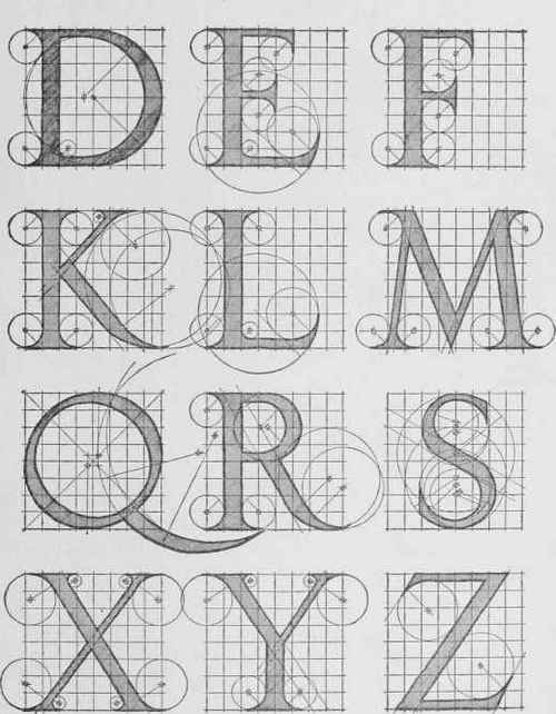
> on the Times New Roman font, which is quite a bit more
> complicated than some of the others. Thanks for the
> replies though.
Also, what is the particular text string that you want to do this to?
But yeah Times New Roman has all kinds of varying widths and little serif parts in each letter so it's going to be more difficult to try and get a center line curve on something with those kinds of varying shapes in it.
Also your original post you wrote:
> All I want to do is extrude some text and apply a 45 deg
> bevel/chamfer to the upper edges, so that they all converge,
> to achieve an apex along the centre of each letter.
Like Steve mentioned above, you may need to decide a bit more specifically about what the correct output is supposed to be.
These may be kind of mutually exclusive things you are trying to do here - if you have something of variable width, then putting a 45 degree angle bevel on it will not result in the bevels colliding together at an actual single z level center line.
So the overall goal would need to be specified a bit more clearly I think - would you want to emphasize 45 degree sides and have a colliding centerline of varying height? Or would you want to have a single height centerline with something other than 45 degree angle sides?
One thing you could do would be to draw a 45 degree line and sweep it along the outer path of the letter, that may give you some pieces to work with, like this:

That will generate some overlapping pieces in the compressed areas:

But you can then trim those surfaces to cut them back to where they intersect with one another:

There you can see the kind of "varying height" result where various 45-degree angled results from variable thickness areas are colliding. If the intersection was done from the holes outward as well even the main center line would have that kind of varying height which I suspect you would not want. So you may be looking for some kind of hybrid result, with "45-degree"-ness emphasized in some areas (possibly on the outermost contour?) and "even z level" emphasized in others... Or maybe a totally even z level is more important to you? In that case you won't be able to get 45 degree angles on things then...
At any rate, you can see that it's not a very simple problem, and there seems to be some mutually conflicting constraints in the original problem statement.
- Michael