Show messages:
1-19
20-35
From: ptaszek
Yeah U right guys :) I just thought the current one is a bit outdated with sketch style. Anyway I agree that my proposals are not better ;) I just had the problem with this white glow for current one. It looks like 1px alpha issue, but maybe because I see it often on my renderings :P
From: aphaits
Hi, rather than making a new logo reimagined thread, I will reply here instead.
Was trying to tidy up windows start tiles and tweaked a few things using edgetile.
Trying to make the tiles clean and somehow ended up designing a nice clean logo version of Moi 3d.
It's not meant to replace or suggestion or anything, just a nice visual tweak for my own use and I felt like sharing it for possible critique.
Here's my take on Moi 3d logo :)
The logo is based on the original 'idea-lightbulb' logo and made up from the letters M-o-i.
M is used as the screw base of the bulb, O as the bulb, and i as the light filament inside.
The sideways M looks kind of like a sigma sign and the logotype uses Google's Montserrat Font.
Both reasoning for the sideways M and font choice is for aesthetic purposes emulating the clean look of the software.
Logo color is based on the feel of the Moi 3d viewport interface in general.
Large + Wide Tile: Main logo for splash or marketing (not that the software needed splash, loads so fast you'll miss it anyway)
Small Tile: Icon usage for small to tiny brand mark for app or online
Background image made by Amin Akhshi on Artstation:
https://www.artstation.com/amin/blog/PPXm/gamma-knife-moi3d
I really love the combination of pale yellow highlight on grey and somehow makes it synonymous with Moi 3d in my mind.
Hope you enjoyed this tidbit :)
- David


Image Attachments:
 Moi 3D - Large Tile.jpg
Moi 3D - Small Tile.jpg
Moi 3D - Wide Tile.jpg
Moi 3D - Win10 Start.jpg
Moi 3D - Large Tile.jpg
Moi 3D - Small Tile.jpg
Moi 3D - Wide Tile.jpg
Moi 3D - Win10 Start.jpg
From: Death
Like the "light bulb" (inspiration) icon idea, but think the textual "d" of "3d" should be capitalized -> "3D"
From: Frenchy Pilou (PILOU)
...and the "M" can be used for a spring inside an animation for bounce the bulb with some flashing of lights!
From: aphaits
Yes! I struggled with that actually in my head but I went with a lowercap 'd' look to soften the whole logotype feel to make the 'Mo'i stand out more than the '3D'.
But it still works also with capitalized D, just minor visual preference on my side :)
From: amur (STEFAN)
The name is actually MoI and not Moi. See the Software and website ...
Regards
Stefan
From: pafurijaz
Nice, but the Moai is lost here, I think is a part of logo..
From: aphaits
Yes I'm aware, this is mostly an aesthetic decision for personal use.
I uploaded a version with proper letter capitalization.
Which one do you prefer?
It still works both ways :)


Image Attachments:
MoI 3D Alt - Large Tile.jpg
MoI 3D Alt - Small Tile.jpg
MoI 3D Alt - Wide Tile.jpg
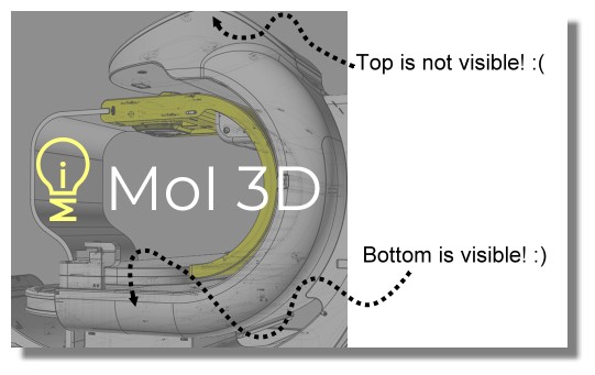
From: Frenchy Pilou (PILOU)
No possibility to have the up top object visible?
(like you have the bottom in the first image)
From: shane (SHANE_W)
Lowercase "d" looks much better to me. I would change the "l" to "I" so it doesn't look like MOL 3d.
From: aphaits
Hi, not sure which part you meant. Can you elaborate?
From: aphaits
One of the reasons I liked the lowerscase 'i' in the logo :)
but a modified 'I' with added serif might work, or maybe also another font option with a slab serif corner style.
From: Frenchy Pilou (PILOU)
<< can you elaborate?
Sure! :)
From: 3image
This looks like a bulb on a spring. :-D
From: Ronster (RON)
Hi Pilou
I think your light bulb logo is great. In fact I'm using it myself on my backups dvd case. Definitely think it should read Moi3d - small i and d and the image you've chosen is fine cropped top and bottom. If you got the whole thing to fit there'd be too much surrounding space. On mine I just brightened the yellow to help it stand out a little better against the grey. As it's only really for my own use I hope you don't mind. To be honest I've been really ill the last few months and getting back to doing some 'creative' work has helped no end. Also caught up with leaning how to do much more with Moi :)
Regards
Ron
Image Attachments:
Moi3d box top.png
From: Frenchy Pilou (PILOU)
Cool packaging! :)
Show messages:
1-19
20-35